
What it Means to Have a Responsive Website
When you use responsive web design, you make sure that your web page will look appropriate no matter what device someone is using. The goal is to ensure that your website stands out whether someone is looking at it on their computer, tablet, or phone. When you don’t have a responsive web design, your website looks unprofessional. Moreover, an unresponsive website can be hard to read and use, which counteracts the purpose of a website. Website responsivity makes sure that your website automatically appears as it should on all devices so that potential clients can be readily engaged.
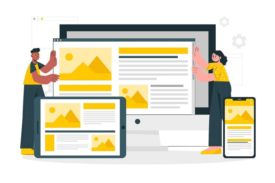
What are the Basic Things Required for Responsive Web Design?
You may be wondering what is required for responsive web design, and several key features set apart a responsive website from a website that makes people want to disengage with your brand. Read also: Difference Between Responsive & Progressive Web App
Watch the Whitespace
Whitespace has a significant impact on the design of your website, and across platforms, it can easily be thrown off balance. Be vigilant about your paddings and margins. You need to maintain your whitespace, especially for mobile viewing. Try to keep the ratio of whitespace the same on all devices.
Aim for At Least Three Layouts
There are so many devices out there that you cannot design custom layouts for each one, but having a small, medium, and large layout to estimate how different viewers will see your website.
Keep Things Uniform
Users should have the same experience no matter what platform they are using. Make sure that all forms, information, and menus are consistent throughout your website.
Create an Intuitive Experience
If no one can find anything on your website, the effort you put into your pages and content will be to no avail. You want your website navigation to be user-friendly, so whoever comes onto your website can readily find what they’re looking for. If they can’t find what they are looking for quickly, people tend to give up.
Treat All Platforms Equally
You want to make sure that no matter what your users use for browsing, the content you offer is compatible with their devices. Don’t prioritize web browsing or mobile browsing. People should be able to use all platforms equally. If your design can’t adapt to various platforms, it isn’t as effective as it needs to be.
Optimize Images
When you add images to your content, you need to make sure that the load time of images on your website isn’t too cumbersome. It reflects poorly on your brand when it takes forever for images to appear. No one wants to wait that long! People will end up leaving before they’ve even looked at your site if you don’t optimize images.
Imagine You’re Going on the Site for the First Time
Try to put yourself in the shoes of someone who is seeing your site for the first time, and think about how they would experience your web design. You can also seek feedback from others to collect data about areas in which you can improve your design. If you’re asking yourself, “What is the easiest way to have a responsive web design,” the answer is remembering your audience and thinking about how you would feel about navigating your website if you were them.
How Do I Convert an Existing Website to Be Responsive?
Using the tips above, you can start to transform an existing website. Using your current design as a basis, you’ll want to make tweaks that focus on responsivity. Look at your current website on various browsers and write down what you like and what you do not like. Think about your current audience, and using analytical tools, you can determine how your users tend to engage with your website. With that information, you can customize your website to meet demand.
How to Make a Website Responsive Using CSS and Bootstrap
You can use CSS alone to make a website responsive; however, just CSS may become labor-intensive and require more work than you are willing to put in. Using CSS alone is burdensome, which is why you should learn how to make a responsive website using bootstrap. Bootstrap is a CSS framework that is highly effective at helping people create responsive websites.
Responsive Means Better Rankings
Not only does having a responsive website make your website better for potential customers, but it also makes your website rank more highly on Google and other platforms because these platforms prefer websites that users can readily use.
Split Reef is a modern, results-driven digital organization always ready to support clients in their search for digital supremacy. With Split Reef, your budget isn’t going to hold you back from partnering with us to make your project successful. Our offices are located in Columbus, Ohio and Jacksonville, Florida.

