Top Rated Responsive Web Design Company

Responsive Web Design Services

Bring your website into the modern age with a responsive web design company like Split Reef. We can turn static websites into beautiful domains with fluid images and graphics that will really impress your customers and clients. Responsive websites can be viewed easily on any device. Partnering with responsive website design company Split Reef allows you to get multiple sites for the price of one while ensuring that the site features the web tools and content you need to grow your organization.

Responsive Web Design Company

Discover the Power of Responsive Design with our Award-Winning Web Firm

Partnering with responsive website design company like Split Reef allows you to get multiple sites for the price of one while ensuring that the site features the web tools and content you need to grow your organization. When you’re looking for responsive web design services in Columbus, OH or in Jacksonville, FL look no farther than Split Reef. We are a leading full responsive website design company who can get your site responsive.

What is Responsive Web Design?

Responsive websites are websites that can be viewed on any device. Page widths, colors, links, texts, graphics, and videos all adjust automatically to fit the size and shape of whatever screen it’s viewed on — from a large HD monitor to a small phone screen. With responsive website design services, you can ensure that your website features the tools and content you need to grow your organization.

Benefits of Hiring a Responsive Website Design Company

Device-Friendly Website Design

Get a Website What Works for all Devices

With responsive web design services, you eliminate the need for multiple codes for separate webpages and sites for different computers, smartphones and tablets. On large monitors, there’s no loss of resolution, so the images and graphics are as crisp and clear as if viewed on a mobile device. Your brand stays intact across all devices, ensuring that every webpage displays and operates as intended on every screen, every time.

Top-Rated Responsive Website Design Company

Responsive Web Design Services that Improve Viewing Experience

Impress your visitors with responsive web design services from Split Reef. Better graphics, more accessibility and a mobile-first approach means that your visitors are more engaged and more likely to use your services over your competitors. Split Reef employs the latest web design strategies and technologies to transform your website into an effective sales tool for your business.


Anywhere, Any Device

iPhones, Androids, tablets, computers, monitors, you name it. Responsive web design will make your website versatile for any device to view on. Even wearable devices like smartwatches will be able to format your web design and display information from your site.

Compacted Information

The current trend is shifting toward mobile-first design, meaning your website should be mobile-device-friendly above all else. We strategically compact all the information you need on.

Latest Technology

As an experienced responsive web design agency, we employ the latest tech and cutting-edge practices to build and create beautiful and functional responsive websites for each of our clients. You know you’re getting the best, because we only use the best technologies as we build.

Refined Code

We ditched using Flash a long time ago. We use the most versatile and refined programming environments and languages to build your responsive website. Languages like CSS3 and HTML5 have long since replaced relics of programming and we use them because they permit automatic webpage sizing and flexible media retrieval.

Quick and Crisp

Responsive web design services go hand-in-hand with sleek style and modern web design. No more chunky graphics and buttons unaligned with text in the middle of the page; your design loads easily for visitors to enjoy.

Optimized Images

As the size of the screen on which your responsive web site is viewed, so do the images. They automatically reformat and size themselves to fit neatly into the screen. Whether it’s a web browsing window that’s being moved and resized or switching to a phone screen, the images are still clear with high-resolution.

Faster Load Speeds

No one wants to use a website that takes forever to load, and they will grow impatient and leave your website if it isn’t easy to use. By compressing sizable media components and making code more efficient, we can increase the load speeds. This increased speed will make your website run more smoothly and allow potential customers to explore your offerings. Split Reef can audit your website and determine what might be preventing these high speeds and find innovative solutions to issues that may arise.

Search Engine Optimization

Search engine optimization (SEO) gets your business higher in search results. No matter how good your website looks, if you cannot reach potential customers, they will never see what you can offer.SEO is a tool we use to show people your business and make it seem more credible. SEO strategies are customized to your company and its needs.

Higher Sales and Conversion

A good responsive website design company will help you get better sales and higher conversion rates. Getting people to your website is an important step, but if they leave without becoming a customer, the value of those clicks is minimal. You want people to see what you can offer and become paying customers.

Basic Components for Responsive Web Design

What are the 3 Basic Things Required for Responsive Web Design?

Responsive web design ensures that a website looks and functions well on various devices and screen sizes. As a leading responsive web design agency, we focus on three key elements. By focusing on these three essential components, we deliver responsive websites that not only look great but also provide a seamless user experience across all platforms.


Fluid Grid System

We employ fluid grid systems and responsive design techniques to ensure your website adapts seamlessly to different screen sizes and orientations. This means users can enjoy a consistent experience, regardless of whether they're viewing your site on a desktop, tablet, or smartphone.

Benefits:

  • Flexibility: The layout adjusts seamlessly to various screen sizes, providing a consistent user experience.
  • Efficiency: Reduces the need for multiple versions of a website for different devices.
  • Future-Proofing: As new devices with different screen sizes are released, a fluid grid layout can adapt without requiring significant redesign.

Flexible Images and Media

Our team optimizes images for efficient loading and display on all devices. By compressing images without compromising quality, we enhance website performance and reduce load times, resulting in a more enjoyable user experience.

Implementation:

  • CSS Techniques: Use CSS properties like max-width: 100%; to ensure images scale within their containing elements.
  • Responsive Images: Utilize the srcset attribute in the <img> tag to provide different image sizes for different screen resolutions.

Intuitive Navigation

We design navigation menus that are easy to use and accessible on all devices. Whether it's a dropdown menu, a hamburger menu, or a sticky header, our navigation solutions are intuitive and user-friendly, guiding visitors effortlessly through your website.

  • Adaptive Styling: Apply specific styles for different screen sizes, ensuring the design looks good on all devices.
  • Breakpoints: Define breakpoints where the layout changes, such as switching from a multi-column layout on desktops to a single-column layout on mobile devices.
  • Enhanced User Experience: Tailor the design to the user’s device, improving usability and accessibility.

Transform Your Website Today: Partner with the Best in Responsive Design

You need a web design service provider who will craft your website based on not only what looks spectacular but what fits your company’s needs. Give your customers a website they want to use. Your customers have busy lives, and they won’t make time for your company if your website isn’t responsive.

Efficient Responsive Web Design Process

Creating a responsive website that looks great and functions flawlessly across all devices is essential in today's digital landscape. Our streamlined process ensures efficiency and delivers exceptional results.


Web Project Requirements

Before we do anything, we have to determine what you need for your website. We will go over your parameters and determine strategies we will employ to fulfill your expectations.

Design Samples

We never want to make unilateral decisions about your website. Thus, we create samples of various website styles we can offer, and we will allow you to make the selections that most appeal to you. At this stage, designs are not fully polished and give you an idea of the final product.

Content Building

At this stage, we start to make our design a reality. We will give you drafts of our work so that you can see what we are doing and give any necessary feedback.

Testing and Development

When you sign off on what we have done, we can then start to develop the website and do testing to make sure that it works as it should. This step takes the content from the previous step and incorporates it into a functional website.

Getting a Test URL

Once we have ensured that the website functions, we turn back to customers. We give customers a test URL to look at the website and note any issues they may have with it.

First Stage Revision

At this stage, you determine any of the concerns and issues that you may have with the website. We will then address those problems.

Second Stage Revision

You can then determine additional revisions you want before the finalization of the project. Not all customers will need these additional revisions.

Website Goes Live

In the final step, the website goes live. You can now focus on your business as your website reaches your audience.

All Screens, One Solution

Benefits of Hiring
a Responsive Website Design Company

There are plenty of benefits you reap when you sign on with a professional responsive website design company. Just a few of them are faster webpages, lower maintenance needs, higher conversion rates and improved SEO. Responsive web design goes hand-in-hand with effective digital marketing, making it a service you can’t skip on when signing on with Split Reef.


Increase Viewers

Over half of the internet traffic in the United States comes from mobile devices. When you have a responsive web design, you can access customers on both PCs and mobile devices, giving you greater versatility at lower development costs.

Lower Maintenance

Overall, it costs less to exist on both mobile and desktop browsers when you employ responsive web design tactics from a responsive web design agency. Instead of creating content strategies for both mobile and desktop, you have a cohesive vision across all platforms. Furthermore, the one-size-fits-all model of a responsive web design means changes you implement are executed across the board.

Fluid Grids

Sometimes called “liquid layouts,” this type of grid system scales based on the user’s screen, ensuring that all elements resize in relation to one another. Proportions stay the same when web design uses fluid grids implemented in the code.

Optimized Videos and Images

Videos and images are some of the most important design elements on a page. If they’re blurry or the wrong size, then most users will quickly leave your site. Keep them engaged with meaningful and beautiful images and videos that help your bounce rate and increase your CRO.

Enhanced Design Experience

When someone visit your website for the first time, whether on a desktop or smartphone, you have to make a good impression. If visitors have to constantly zoom, shrink, or pinch their screens in order to read your information or study your graphics, they’re going to leave your site and you’ll lose that business.

Improved SEO

In 2015, Google changed its search engine algorithm to include better rankings for mobile-friendly sites. A responsive web design means including mobile users, thus increasing your rankings on the world’s most popular search engine.

Easier Analytics Reporting

Analytic tools now cater to responsive websites, making it easier to pull the data you need from your traffic, site interactions and visitor time to better understand how your SEO tactics are improving your business.

professional SEO Services Columbus SEO

Why Choose Us as Your Responsive Web Design Agency

Our talented responsive web design team can convert your existing website form one that is optimized for a single device and browser to one that delivers the same outstanding user interface and user experience across all internet-enabled devices. With Split Reef as your responsive website design agency, you can rest assured that you will lose none of your legacy content and invaluable data when you upgrade and expand your online presence.

Split Reef is a responsive website design company that responds to the needs of our clients. We have years of experience creating designs that speak to what our clients want to offer their customers. Our designs use current and cutting-edge technology so that your website isn’t already outdated as it is being published. We work diligently to provide the best possible services to our clients.

Our agency offers:

  • A collaborative design process that incorporates your design vision with the expertise of our professionals
  • A detail-oriented approach that ensures every part of the design is optimal for your needs and wants
  • Open communication throughout the process
  • Flexibility and problem-solving in the face of challenges
  • Continued education on prominent techniques and how to offer better web design
  • Knowledge in a plethora of coding languages and web design skills
  • A passion for creating attractive and highly efficient websites
  • Creativity that allows us to make your website stand out and enables us to address unique concerns certain businesses may have
  • A cost-effective operating system promoting efficiency in time, cost, and communication

Is Responsive Design Still A Thing?

Yes, responsive design is still very much a thing. In fact, it's become an essential standard in modern web development and design. Here are a few reasons why:


Device Diversity

With the increasing variety of devices, from smartphones and tablets to laptops and desktops, responsive design ensures that websites look and function well across all screen sizes.

User Experience

A responsive design provides a seamless and consistent user experience, which is essential for retaining visitors and reducing bounce rates.

SEO Benefits

Search engines like Google prioritize mobile-friendly websites in their rankings. Responsive design helps improve your site’s visibility and search engine ranking.

Cost-Effectiveness

Instead of creating multiple versions of a website for different devices, responsive design allows you to maintain a single site that works well on all devices, saving time and resources.

Future-Proofing

As new devices with varying screen sizes and resolutions are released, a responsive design can adapt without requiring significant changes

Accessibility

Responsive design is crucial for ensuring that websites are accessible to people with disabilities. By using responsive design principles, you can create websites that are easier to navigate and understand for users with visual impairments, hearing impairments, or motor disabilities.

Engagement

Responsive design can improve user engagement by providing a more tailored experience. When a website is designed to fit the screen size of the device being used, users are more likely to stay engaged and interact with the content.

Brand Consistency

Responsive design helps maintain a consistent brand identity across all devices. By ensuring that your website looks and feels the same on all screens, you can strengthen your brand recognition and build trust with your audience.

FAQ

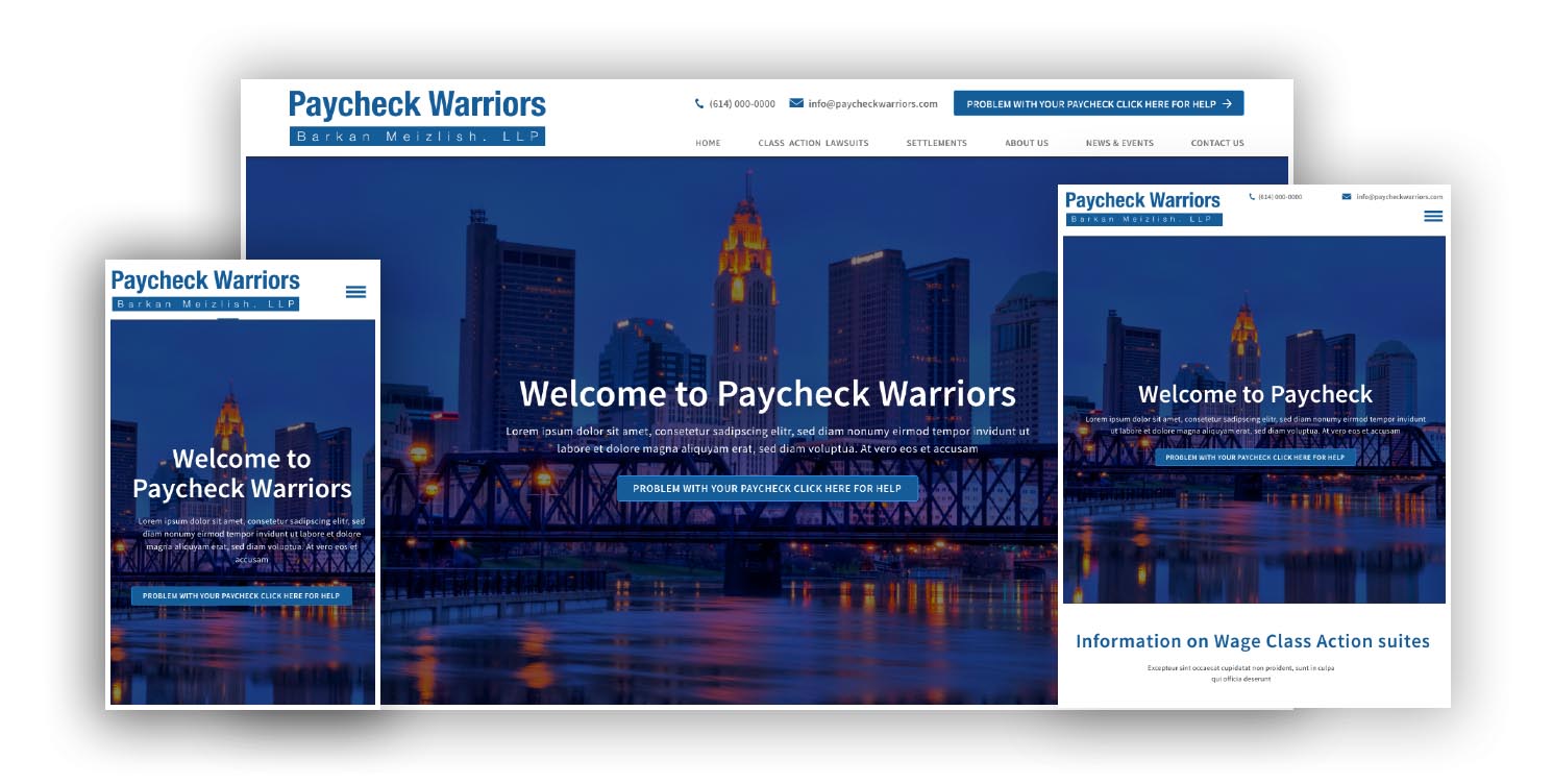
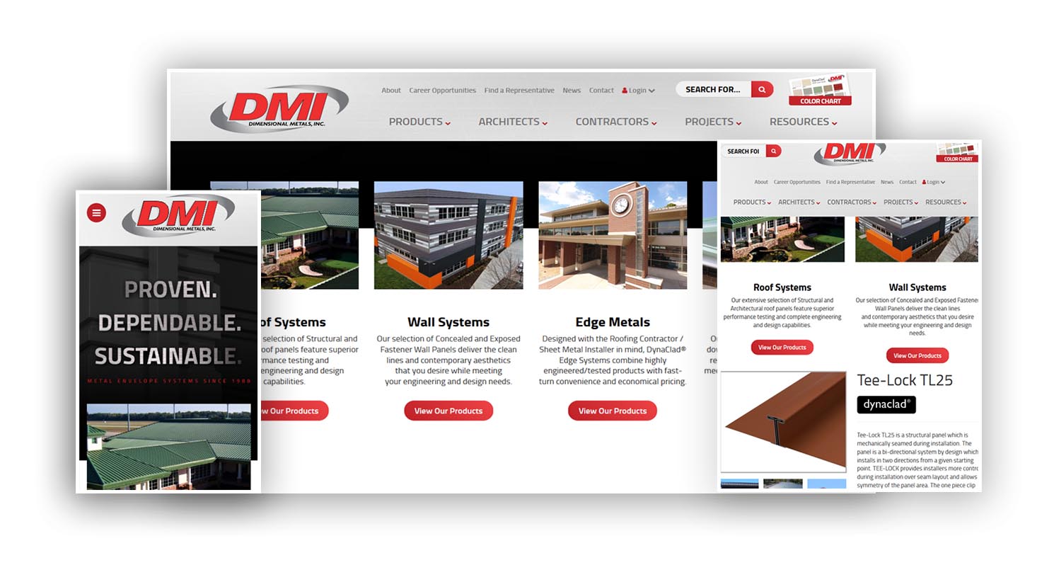
What are the benefits of responsive web design?

In a world where people use many different devices to access the internet, web design should be responsive. If a website is not responsive, it can be hard to use. An unresponsive website makes your brand look unprofessional. People don’t always consciously notice a responsive website, but they always notice when it’s not working as it should.

Can I convert my existing website into a responsive one?

Yes, if you already have a website, there are steps we can take to make it responsive. Tools like CSS and HTML are highly beneficial in this process.

Why do I need to make my website mobile responsive?

Nearly 54% of all website traffic is from mobile browsing. People most spend time browsing on their phones, and if your website is not responsive on mobile, you are alienating so many potential customers. The popularity of mobile devices continues to grow and will continue to be a dominant force for the foreseeable future.

Do you use templates for creating responsive web designs?

Templates can be a useful starting point for web design that can save time and energy. In all projects, we customize our work and ensure that we aren’t just using a template. Modifications and adjustments allow us to provide high-quality, original content.

Do you work with other platforms like WordPress, Joomla, or Drupal?

We work with these platforms in our projects to create the best projects. We know that the only way to stay ahead of the game is to use the best tools in the industry, which include WordPress, Joomla, and Drupal. Our team of experts always stays up to date on current platforms and tools that can make our web design better.

What is the easiest way to have a responsive web design?

Creating a responsive web design involves implementing a combination of best practices and techniques. Here are some simple steps:

1. Use a Responsive Framework like Bootstrap or Foundation 2. Use a flexible grid system, 3. Implement fluid images, 4. Utilize media queries, 5. Test your design on multiple devices.

By following these steps, you can create a responsive web design that provides a great user experience across all devices. Are you working on a specific project that you need help with?

How can I track the progress of my responsive website?

Throughout the process, you can reach out to us with concerns, and we will ensure you never feel lost or confused. Furthermore, we keep you updated as we move forward to each new stage in developing your website.

Is Responsive Website Design Service Expensive?

How expensive is responsive web design? These are the questions that frustrate most of the business owners who want to get a responsive website designed for their business. The answer lies in the type of business you run and the audience who visits your website. Simply put, responsive web design is not for everyone. However, for most of the businesses who have younger audiences that browse their site from smartphones, iPads and Android devices, it makes much more sense to go for a responsive web designing. Find out your site usage patterns in Browser and OS report of your site's Google Analytics account. If a considerable size of audience is flowing through the iPhone/iPad channel, it is time for you to go responsive. For websites that already have a mobile version, it makes sense to go responsive too as the need of managing two separate sites will no longer be there.

How much does responsive web design cost?

The web design price varies greatly depending on the types of components you need and the elements you want. You can schedule a consultation with us to get a better idea of what you would have to pay to get your website to where you want it.

Does Google penalize non-responsive websites?

Yes, when your website is not responsive, you may be penalized, and your search engine results won’t be as high.

What should I know to get started with responsive design?

All you really need to understand to get started is the value of responsive web design and how it can improve your business. We can help you better understand what we’re doing and why we’re doing it as needed during the process.

Which company is best for web designing?

We think that Split Reef is the best company for web design, but of course, we are biased. A good web design company not only knows how to complete high-quality web design but also knows how to communicate with customers and facilitate strong interpersonal relationships. Our relationships with our clients allow us to build better websites and understand our clients’ goals.

Split Reef’s Responsive Web Design Work

As one of the best responsive web design companies, we have the stats and projects to back up our talk. Take a look through our gallery of works to see some of the responsive web design services we provide, and let us know how we can help bring your website into the modern era of technology.

Responsive Web Design Company

Pay Check Warriors

Responsive Web Design Services

Dimensional Metal

Ready to get Started?
SUBMIT YOUR PROJECT DETAILS
Get Started